Product Design · UX
How to Run a Product UX Audit: From Findings to Action
A practical approach to reviewing product experiences, identifying meaningful issues, and turning findings into clear next steps.

A UX audit should do more than produce a long list of interface problems.
The real value comes from understanding what is happening, why it matters, and what should happen next. A useful audit connects user experience, product goals, accessibility, content, design consistency, and implementation — not just visual polish.
Start with context
Before reviewing screens, understand what is being reviewed. A checkout flow, internal dashboard, mobile app, and onboarding experience may need very different criteria.
Start by defining:
- Product or feature
- Platform
- Target user
- Primary user task
- Business goal
- Audit goal
- Evidence already available
This creates a baseline for the review and helps avoid judging an interface based only on personal preference.
Review the experience from more than one angle
Usability is important, but it is only one part of the experience. A practical product UX audit can review the product through eight complementary lenses.
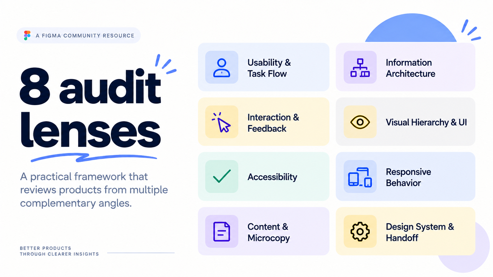
Can users complete the intended task clearly and efficiently?
Is information structured in a way users can understand and navigate?
Does the product clearly communicate actions, states, progress, and results?
Does the interface guide attention and make information easy to scan?
Can people with different abilities perceive, understand, and operate the experience?
Does the experience adapt intentionally across different screen sizes?
Do labels, instructions, errors, and actions help users understand what to do?
Is the solution consistent, reusable, and clear enough to implement?
Separate evidence from assumptions
One of the most important parts of an audit is knowing how strong the evidence behind a finding actually is.
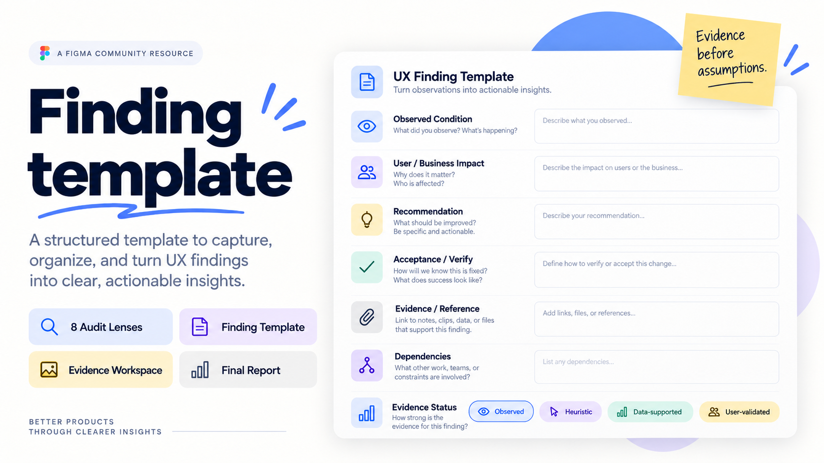
Observed — something visible in the current experience.
Heuristic — a concern based on UX principles or established patterns.
Data-supported — analytics or other quantitative evidence supports the finding.
User-validated — research with representative users supports it.
A reasonable UX assumption is still an assumption until evidence supports it.
Severity is not the same as priority
Not every problem needs to be fixed immediately. Severity can describe how serious an issue is: S1 Critical → S2 Major → S3 Moderate → S4 Minor.
Priority should also consider: Impact · Reach / Frequency · Confidence · Effort.
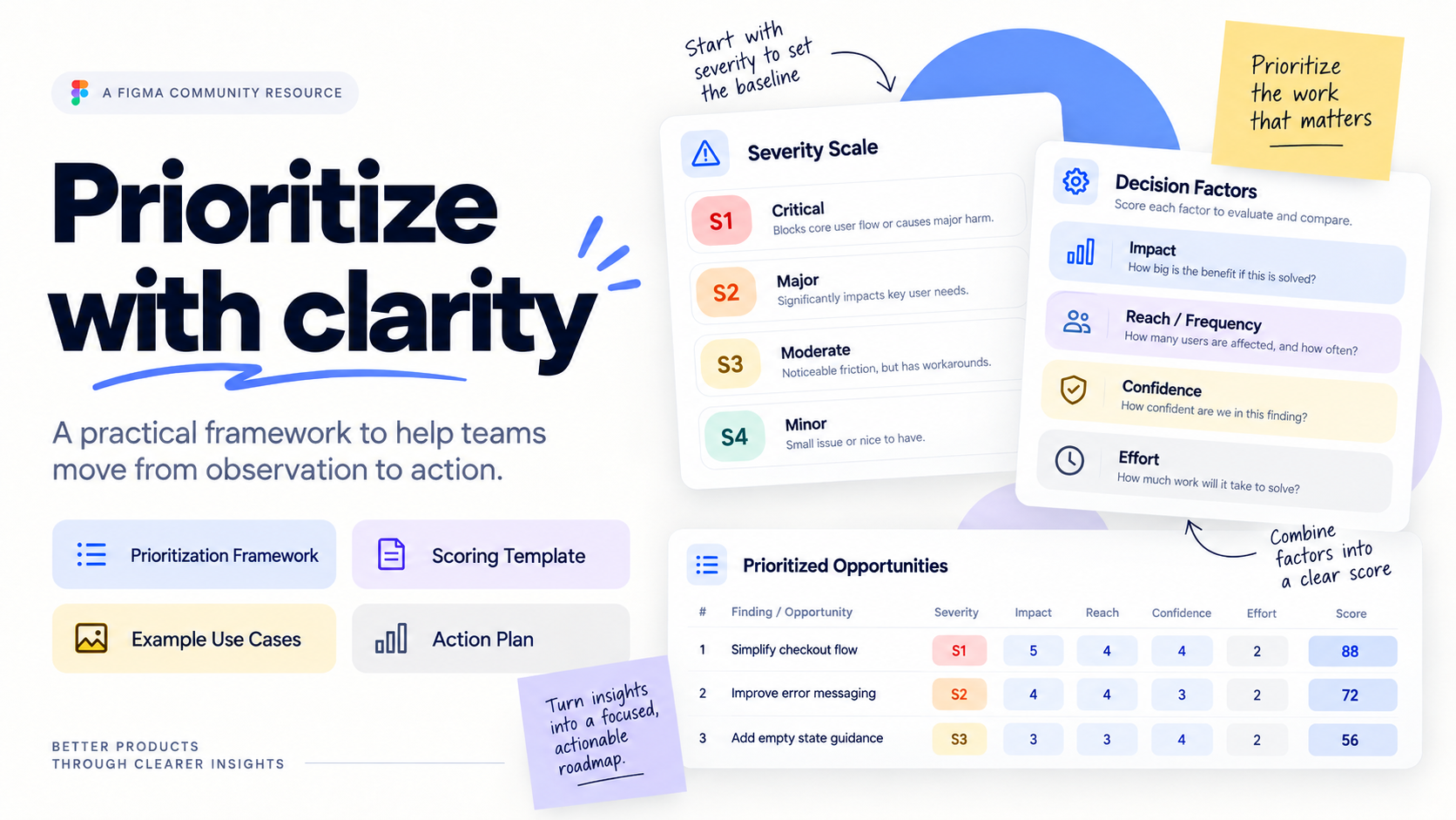
A serious issue affecting a rare edge case may need different treatment from moderate friction affecting most users every day.
The goal is not simply to fix the most visible problem. It is to focus on the improvements that create the most meaningful value.
Turn observations into actionable findings
Instead of writing “This screen is confusing,” structure the finding so another person can understand and act on it.
Observed condition — What is happening?
User / business impact — Why does it matter?
Recommendation — What could improve?
Evidence — What supports the finding?
Dependencies — What else needs to be considered?
Acceptance / Verify — How will the team know the issue is resolved?
This shifts the conversation from subjective feedback to clearer product decisions.
Close the loop
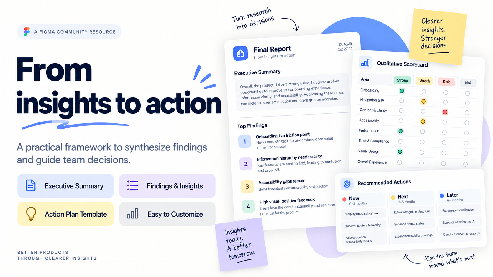
An audit is not finished when the issues have been documented. The findings still need to be synthesized into something the team can use.
The result should make three things clear:
What needs attention? Why does it matter? What happens next?
That is where a UX audit becomes useful — not as a list of problems, but as a tool for improving the product.
Free Figma Community Resource
Product UX Audit Kit
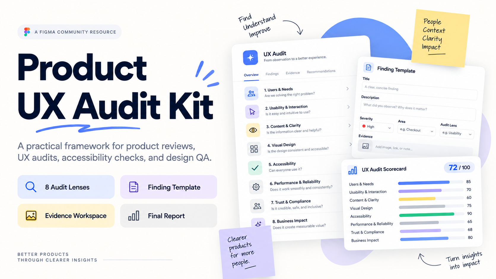
The Product UX Audit Kit brings this process into one reusable FigJam workspace. It includes audit context, eight review lenses, severity and prioritization guidance, evidence tracking, a finding template, a worked example, a qualitative scorecard, and a final audit report.
Duplicate the Product UX Audit Kit →